TEAM
We have a team of 25 professionals working under the same roof
CLIENT
We have more than 110 active clients from across the Globe
COMMUNITY
We have a team of 25 professionals working under the same roof
EXPERIENCE
8 years of significant industry experience
PARTNERS
10 International Business Partners across US, UK and UAE
GROWTH
40% above company growth per annum
Featured In

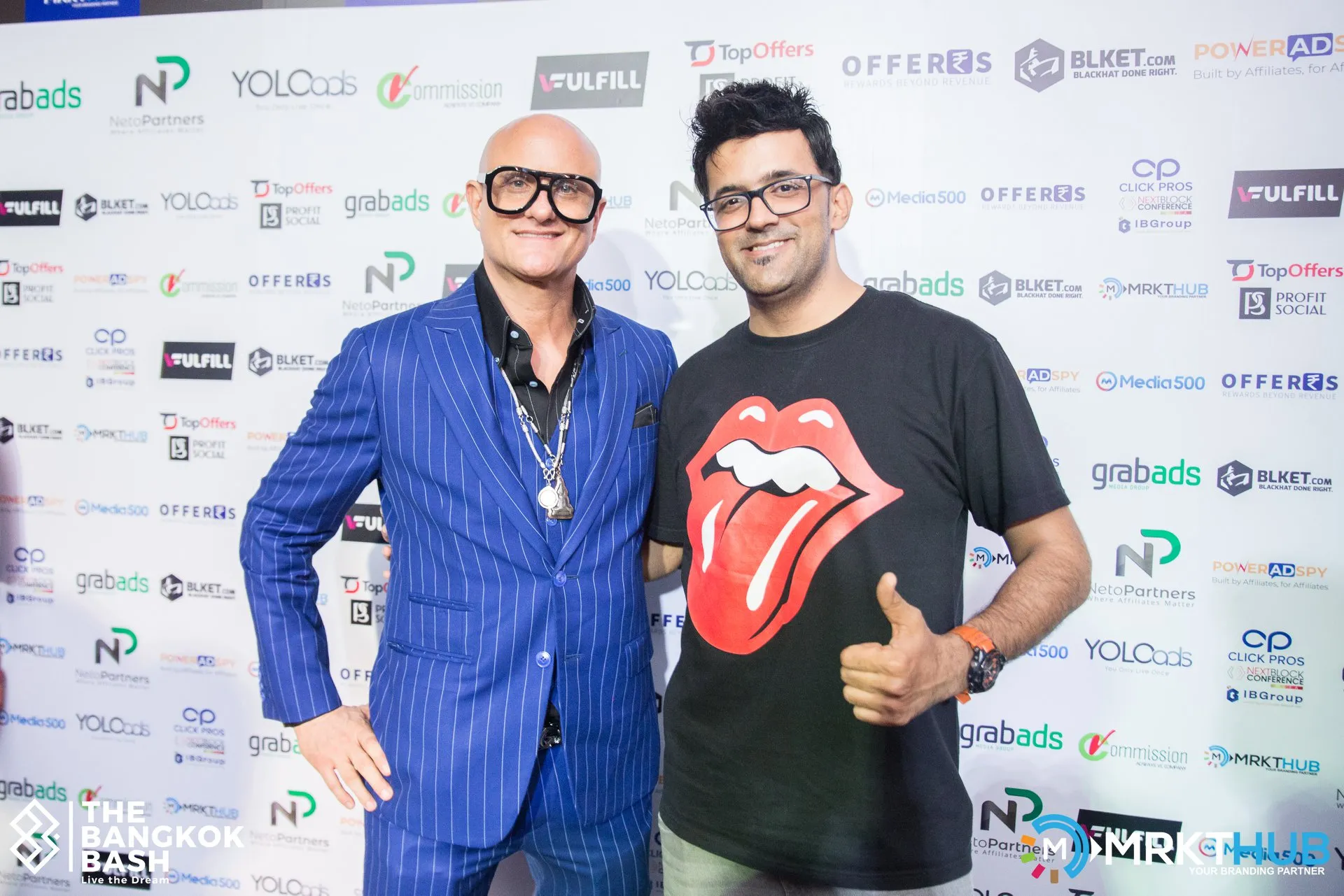
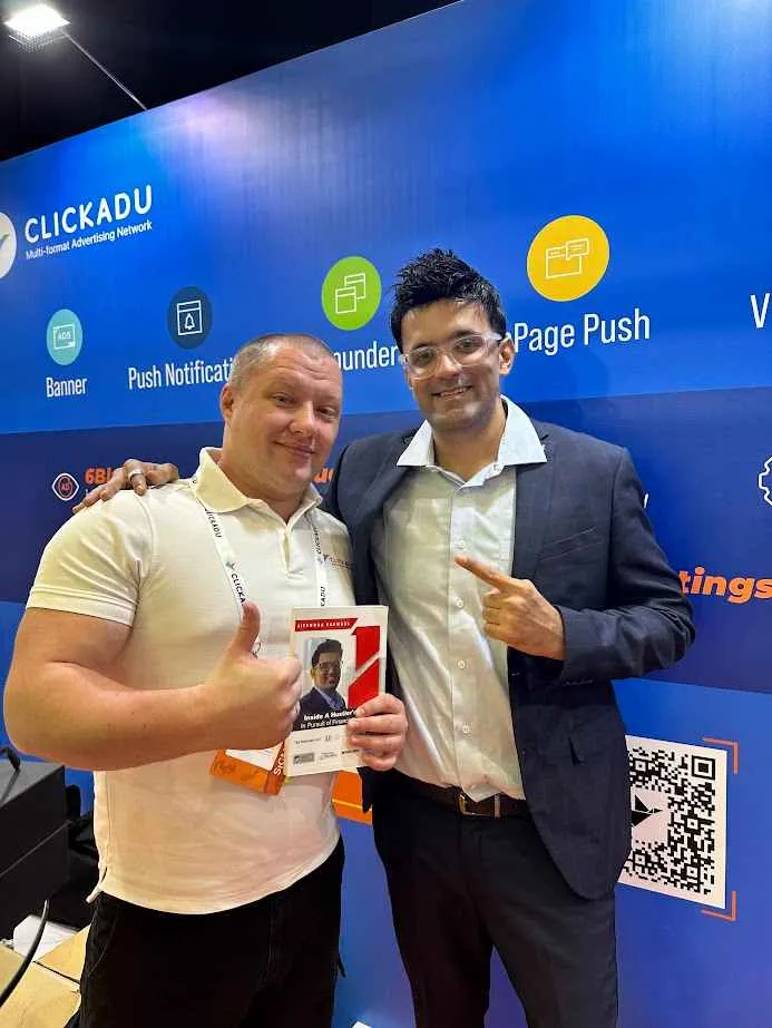
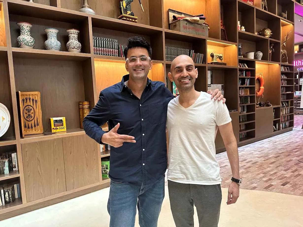
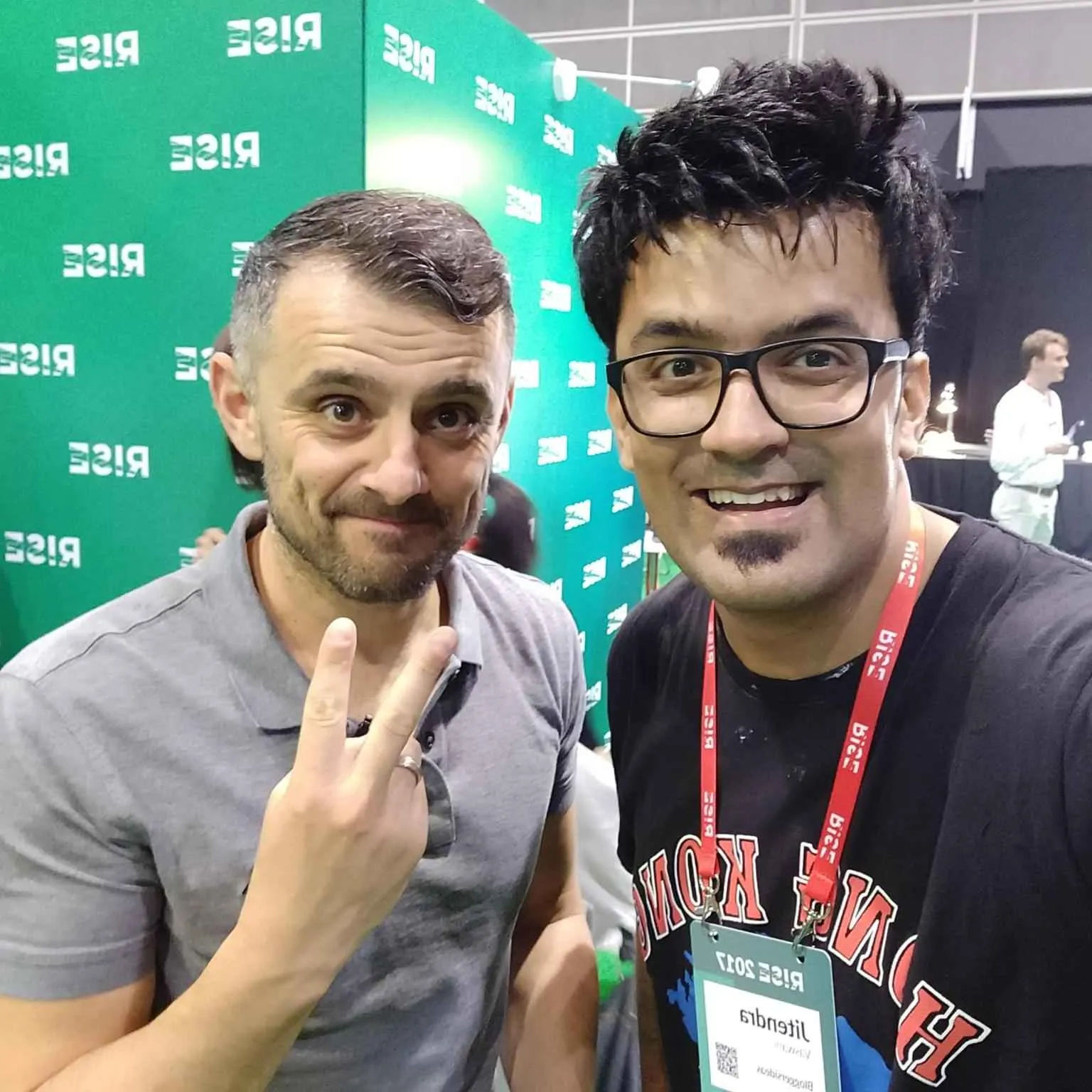
Client's I've worked with


Online & Offline Trainings
Jitendra Vaswani is often sought out as a source of personal branding ninja and SEO specialist in the world of internet marketing. He routinely conducts digital marketing workshops at conferences and events all over the world. His informative and interactive workshops provide in-depth coverage of topics needed to become highly competitive in the digital marketing world.
Invite Me To Speak
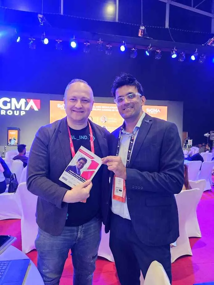
Jitendra Vaswani is an internationally renowned, seasoned keynote speaker with deep expertise on SEO, Google Ads and personal branding. He has spoken to audiences from 25 to 3,000 around the world. The single mission of Jitendra Vaswani is to change the way millennial’s are educated and bringing the thoughtful mindset shift to people’s lives.
PR Marketing
We solemnly believe that the Public Relations (PR) of your company involves a variety of programs designed to maintain or enhance the image, products and services your brand offers. Hence we harp on the fact that successful implementation of an effective public relations strategy can be a critical component to a marketing plan. Public relations, is indeed one of the most effective methods to communicate and relate to your market.
Play Video
JOIN THE COMMUNITY OF GREATNESS & REACH YOUR ULTIMATE HUMAN POTENTIAL
Inside A Hustler's Brain Podcast
-by Jitendra Vaswani
Best-Selling Author on Amazon for The Growth Hacking Book 2
-by Jitendra Vaswani
Learn How to To Be Digital Hustler & Be Location Independent
-by Jitendra Vaswani
Hire us for Branding & Digital Marketing Services
1
SEO
Start your Million-Dollar 💰 Niche Blog Journey
2
Video Editor
Start your Million-Dollar 💰 Niche Blog Journey
3
PPC
Start your Million-Dollar 💰 Niche Blog Journey
4
3D Animation
Start your Million-Dollar 💰 Niche Blog Journey
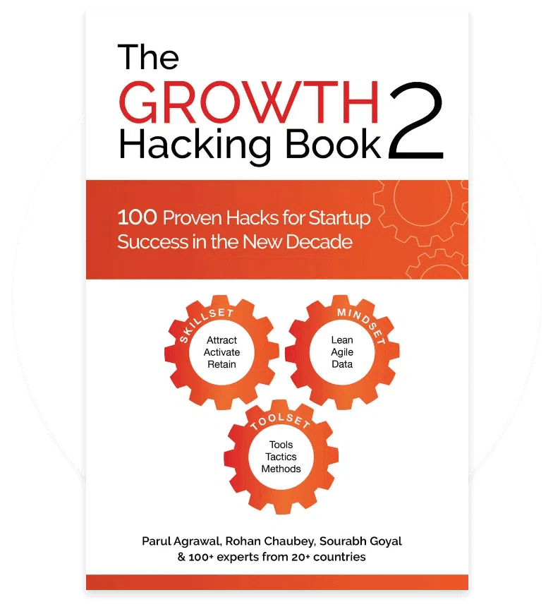
BEST-SELLING AUTHOR ON AMAZON FOR THE GROWTH HACKING BOOK 2
Best Sellers Rank:
- #1 in Networking & Communications eBook
- #2 in Tech Culture & Computer Literacy eBooks
- #5 in Economics (Kindle Store)
- #485 in Kindle Store (See Top 100 in Kindle Store)
Testimonials
Jitendra is not only a pioneer of digital entrepreneurship, he is also an ambassador of the 'new rich' from India.
Sara Davis
Jitendra Vaswani is top class PR digital marketing expert I worked with, he is best and knows his job very well in terms of marketing of product.
Elena A
Jitendra is an excellent digital marketing expert and the best Indian digital marketing expert who I have met and worked with.
Gemma Purnell
Previous
Next
With Industry Experts