The design of your blog should be Clutter free blog design and easy to use.
According to Time.com, 55% of online visitors spend less than 15 seconds actively on a page. What do you believe is the best way to get readers’ attention and keep them interested?
Is that a snappy headline you’ve come up with?
Is this the opening sentence of your piece?
Is it the stuff that everyone tells you to produce?
While having high-quality material helps your blog, it isn’t the primary factor that will maintain visitors to your site.
What, therefore, is the answer? How your blog looks is the solution.
According to Forbes.com, we only have seven seconds to establish a strong first impression in business meetings. Your blog can benefit from this strategy as well.
People are put off by blogs that appear to lack professionalism, just like people are put off by unkempt attire in a business meeting. What if your material is overflowing and your readers are unclear where to begin? The quality of your material will mean nothing if a reader can’t locate what they’re looking for or is unable to browse your website easily.
When it comes to making a good first impression, your blog design counts. What methods can you employ to make your design better?
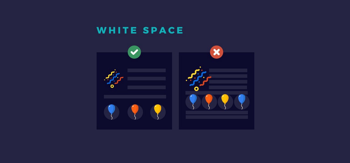
Make Use of Whitespace.
This is the space surrounding your paragraphs, sentences, and images. Basically, it helps to break up your text and guide the reader’s attention down the page. Whitespace and information should be evenly distributed across your blog to keep it from looking cluttered and suffocating.
The idea of “chunking” is also created through the use of whitespace. For example, readers can see that each component of your sidebar is distinct because of the white space between them. This facilitates the search process for the reader.
Scannable Text Formatting
Face it, most blog readers won’t read your posts word-for-word. They’ll skim it. Congratulations if you’ve made it to the end of this blog article! You belong to an exclusive group.
As a general rule, most people prefer to scan a page rather than read it word-for-word. Your whitespace might come in helpful here, making scanning distinct parts simpler.
Scan-ability, or the ease with which readers can scan and read your material, may be improved in the following ways:
The use of subheadings for emphasis.
- Make your paragraphs as brief as possible.
- Using lists to break up your information is a good idea.
- Bolding just the most crucial points in your writing.
- Put important quotes in the middle of the page.
- Color contrast should be used with caution.
- Increasing the size of crucial sidebar content.
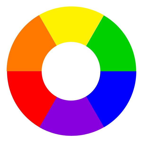
Reduce the number of colors you use.
The use of too many colors or improper ones might confuse a reader. How can a reader know where to begin if every color of the rainbow is employed? Using an excessive amount of color might overwhelm the viewer’s senses and cause your site to appear cluttered.
Similar to using colors wisely, you’ll want to do the same thing. A good rule of thumb for creating an eye-catching newsletter registration form is to keep the rest of the page’s colors neutral and use a bright hue to bring attention to the form’s specific area.
Keep your site’s color scheme to no more than two or three primary hues. Make certain that your material is easy to read before anything else. Using a dark hue on a light backdrop is often the best option.
Your readers will become confused if you have a sidebar that is too busy. In addition, if you have sidebar widgets that you don’t use, they merely detract from the aesthetic appeal of your content. Among the items you should put in your sidebar are:
- the ability to do a search
- Form for signing up for a service.
- Links from various social media platforms
- Categorization resources
In addition to sidebar advertisements, you may also place them there, but don’t overdo it.
Your sidebar options should be pared down if none of your readers are using them; this includes calendars and recent comment widgets.
The most essential thing to remember is to keep your sidebar to a minimum so that your viewers can easily navigate your site.
It’s better to strategically arrange the tabs on your website’s navigation bar than to stuff everything into a single row at the top. Using this easy trick, readers will have an easier time locating the information they want.
To begin, decide which pages should be displayed in the top navigation bar. Some of the alternatives you should have readily available are your homepage, about, and contact pages. When a user hovers their mouse pointer over one of your sub-pages, a drop-down menu of related sites will emerge.
Make sure to keep in mind that not all of your site’s pages should be included in your navigation bar. As a result, it will be a lot easier for visitors to locate what they’re searching for without having to go through all of these pages.
Utilize a Web Theme That Is Mobile Responsive
In 2014, more individuals used mobile applications to access the Internet than desktop computers. That’s how quickly mobile technology is evolving. Make your blog mobile-friendly because more and more web activity is taking place on smartphones and tablets.
Why? Because mobile customers can’t read or click on links on desktop-only websites, they’re more likely to leave your site altogether.
A responsive theme is one that adapts to the screen size and resolution of the device being used by the reader. To make your material simpler to read, whether a user is on a tablet, smartphone, or laptop, a responsive theme may modify the navigation bar and the sidebar widgets.
Redesigning your site with a mobile-friendly theme or just adding a plugin such as WPtouch Mobile Plugin is all it takes to get your site responsive.
Your blog’s initial impression may be shaped in only a few seconds, so it’s imperative that you do everything you can to make your blog’s visitors feel at home.
To keep your readers interested in not only your content but your site and business as a whole, follow the advice above.


